"Small Fry," William Steig's long-running series of drawings in The New Yorker, presented the lower-class children of the city engaged in play. At times, their activities reflected the darkening adult world around them. During the Second World War, for example, the cartoons took on more serious themes taken from the headlines. Questioning of prisoner, published in 1943, is a novel take on the effects of the war in Europe at home. The original art was sold last month at Swann Galleries in the Illustration Art sale.
"Small Fry" Questioning of prisoner William Steig Original art The New Yorker, February 13, 1943, p. 19
William Steig Swann Galleries, Illustration Art, December 14, 2023 Hammer price
During the Second World War, James A Bowman, a teacher and autograph collector from Newcastle, Pennsylvania, obtained by mail an autograph drawing signed by New Yorker cartoonist William Steig. The envelope is postmarked November 12, 1943 and the card depicts a boy from Steig's popular "Small Fry" series. He looks to be one of the artist's neighborhood toughs. It is available at this posting for $500 from Blue Mountain Books and Manuscripts, Ltd.
William Steig Blue Mountain Books and Manuscripts, Ltd., listing accessed January 1, 2024
William Steig's Small Fry scarf design may have been manufactured by Richard A. Farrar, who produced delightful scarves for more than half a dozen New Yorker cartoonists in the 1940s and 1950s. Small Fry were a popular series consisting of Steig's drawings of children. In this instance, he may simply have presented the scarf designers with six of these drawings and left it to them to arrange them into a square. This scarf is from the collection of modern day New Yorker cartoonist Roz Chast.
Photograph by Roz Chast
Here's the same photograph flipped over for your viewing pleasure:
ʇsɐɥɔ zoɹ ʎq ɥdɐɹƃoʇoɥd
Note: I am once again indebted toRoz Chastfor taking the time to share this superb piece from her collection.
Thanks are also due to Gina Kovarsky and Joel Jacobus, who were so helpful in the early days of this exploration of the history of New Yorker scarves.
There are still more scarves to be found; new designs and color variants are almost certainly out there. Cartoonist Helen E. Hokinson is reputed to have created a Farrar scarf, and hers may not be the only one we haven't seen yet. I'd like to hear from anyone with a scarf with art by a New Yorker cartoonist.
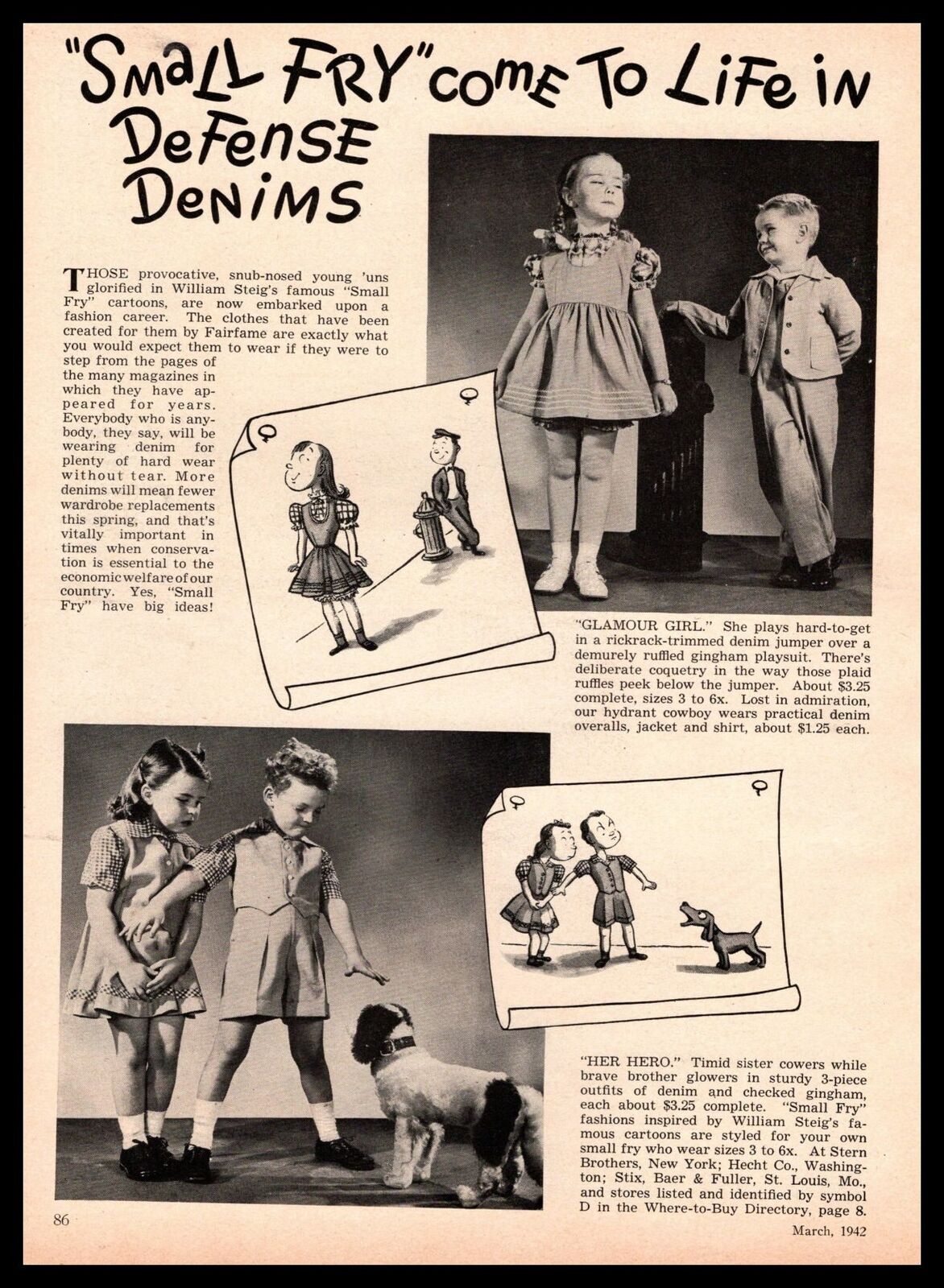
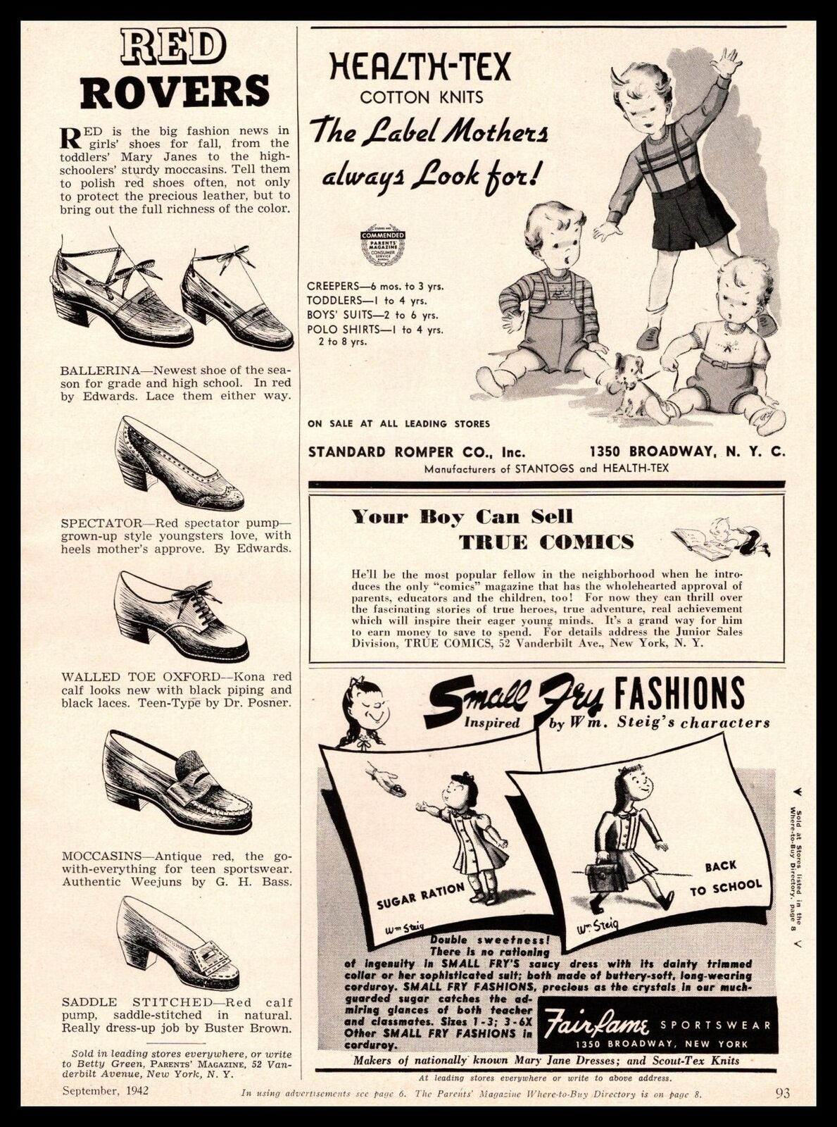
In 1942, magazine promotions aimed at parents touted a new children's clothing line inspired by William Steig's "Small Fry." Just three months after Pearl Harbor, the outfits are marketed as "Defense Denims." Small Fry Fashions were created by Fairfame Sportswear located at 1350 Broadway, which is not far from the Garment District just north of Herald Square. It's interesting to see how a studio fashion photographer attempted to capture the feel of Steig's drawings in Glamour Girl and Her Hero.
"Small Fry" Come to Life in Defense Denims The Parents' Magazine[?], March 1942
For the fall line, two girls' outfits are called "Sugar Ration" and "Back to School." Some of the advertising copy reads, "Double sweetness! There is no rationing of ingenuity in SMALL FRY's saucy dress with its dainty trimmed collar or her sophisticated suit..."
Distinguishing one brand of gasoline from another in the public's eye is one of those challenges that fall to the marketing industry. In the 1930's, well before the interstate highway system came into being, a Shell advertising campaign contended that four miles of every five were driven in stop-and-go traffic. The best gasoline for that situation was said to be Super-Shell, specially formulated to be "motor-digestible."
Motor-digestible? With advertising copy of that caliber, it's such a thrill to see William Steig's inspiring artwork for the campaign. A 1937 black-and-white print ad, under the banner "In the good old summertime"—the same as the name of the 1902 song—has one of the most pleasant depictions of stalled motor vehicle traffic imaginable. Characters indistinguishable from those of Steig's popular "Small Fry" series in The New Yorker cross the street with the traffic light on their way to play baseball. Even the waiting motorist is delighted. Surely it's enough to persuade readers to fill up the tank with some "high energy content," "motor-digestible" gas.
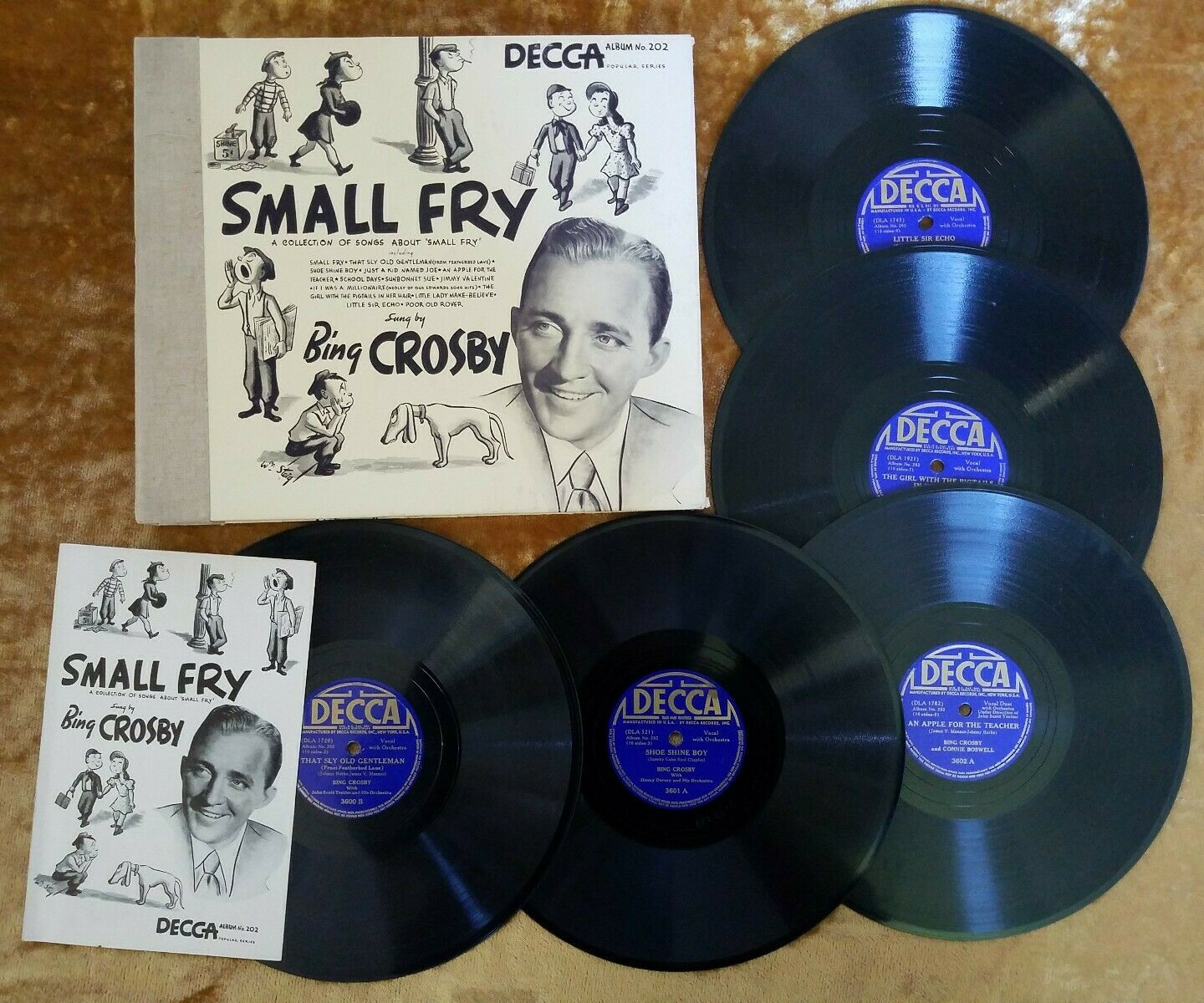
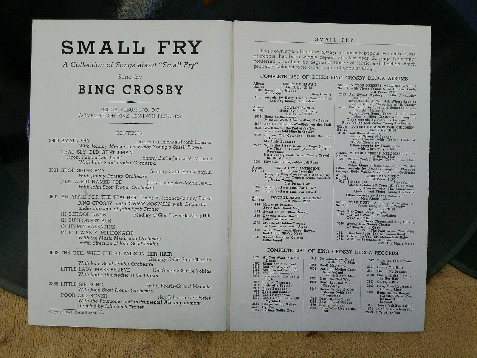
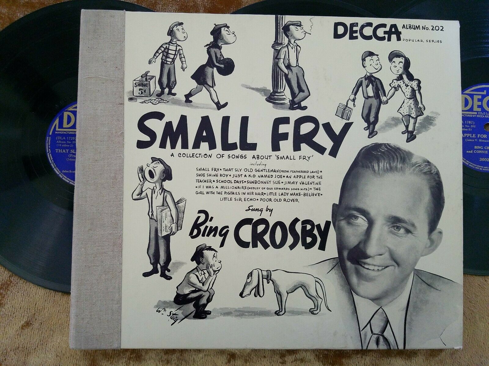
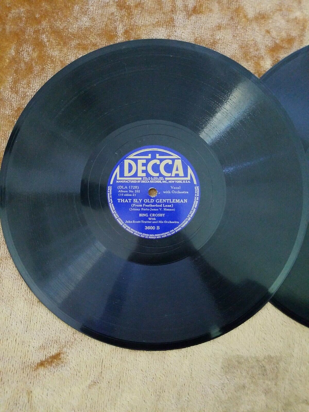
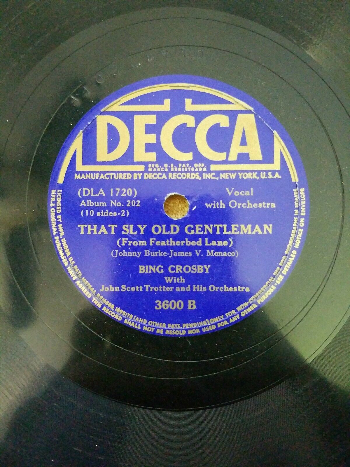
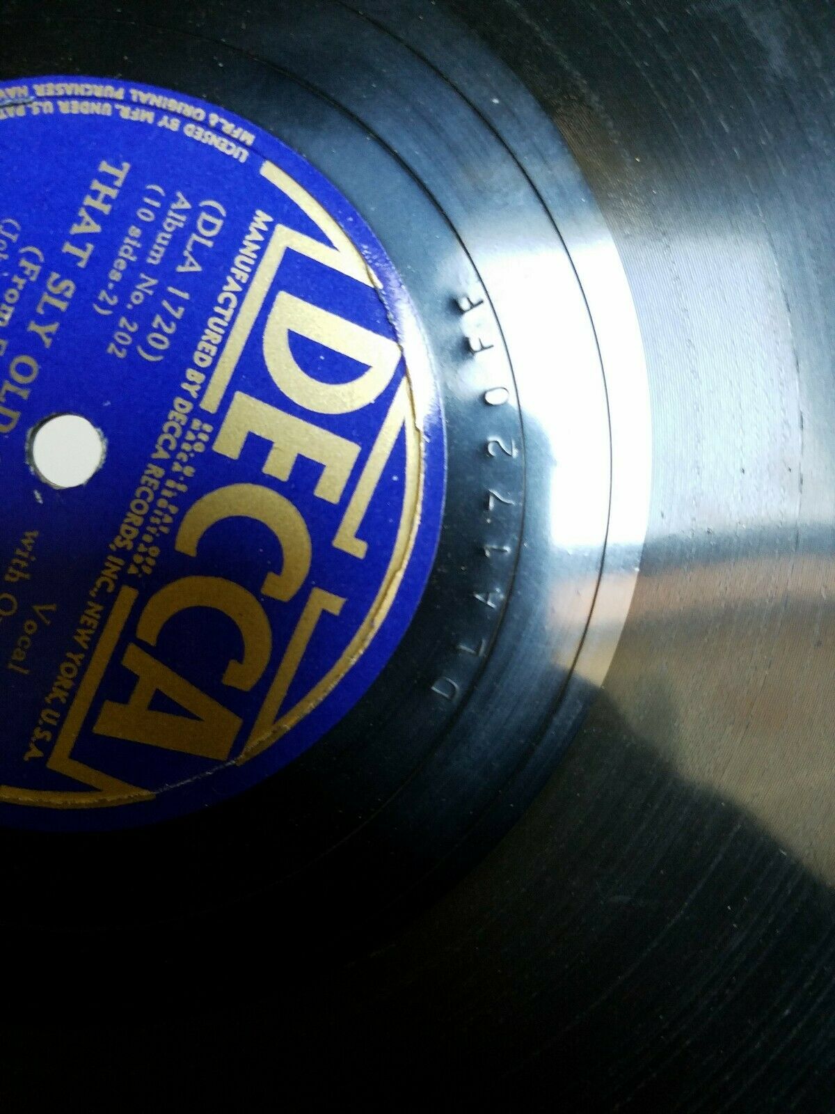
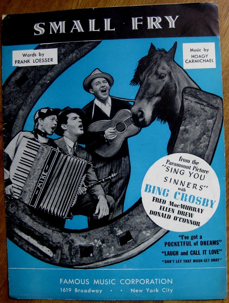
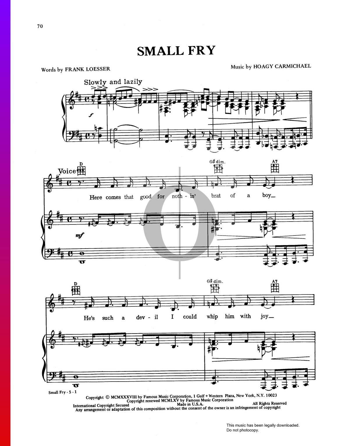
The song "Small Fry" with music by Hoagy Carmichael and lyrics by Frank Loesser was written for Paramount's "Sing You Sinners" (1938). In the film it is performed as an onstage musical number by Bing Crosby as Pappy, a young Donald O'Connor as Small Fry, and Fred MacMurray cross-dressing as Mammy. Crosby later recorded the song with Johnny Mercer and Victor Young's Small Fryers for a 1941 Decca album named "Small Fry: A Collection of Songs About 'Small Fry.'"
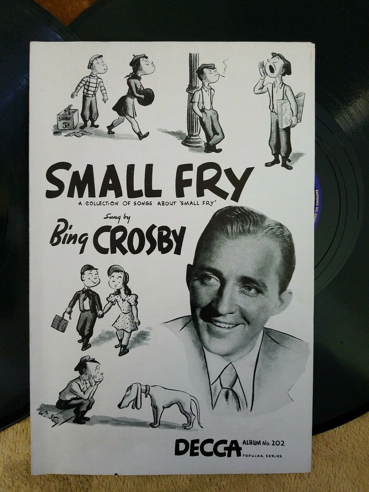
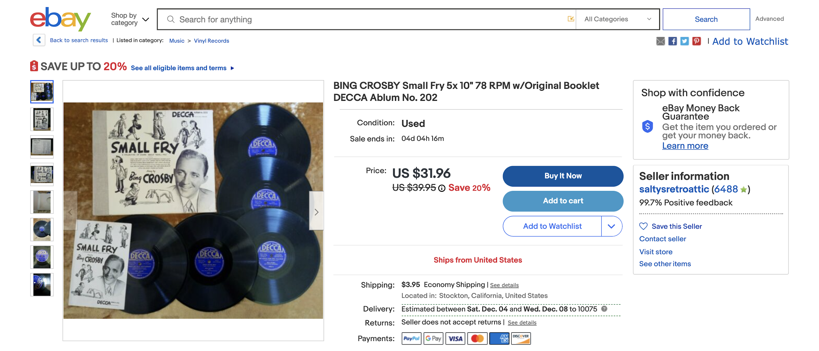
William Steig was already known for a long-running cartoon series in The New Yorker called "Small Fry." His cartoons may have done much to popularize the term or at the very least to associate it with his sophisticated and nostalgic humorous sensibility. It is therefore no surprise that Steig was asked to illustrate the album cover. Aside from the title song, his drawings seem to specifically draw inspiration from the songs "Shoe Shine Boy," "The Girl with the Pigtail in Her Hair," "School Days," "Sunbonnet Sue," and "Poor Old Rover." In addition, the boy hawking newspapers refers to "Just a Kid Named Joe." The boy leaning against the lamppost may or may not reference the song "If I Was a Millionaire." The same Steig drawings are used for the cover of the enclosed booklet, but with a different layout to accommodate the taller proportions. Steig's Small Fry was not collected in book form until 1944, so it's interesting that his series known primarily to readers of The New Yorker was used in this mainstream album promotion in 1941.
Bing Crosby eBay listing accessed November 25, 2021
Note: To me it seems obvious that Bing Crosby's "Small Fry" album with its cover art by William Steig should have been advertised in The New Yorker, but I am unable to find any evidence of this.
You can watch the song "Small Fry" as it appeared in the 1938 movie "Sing You Sinners" on Vimeo here.
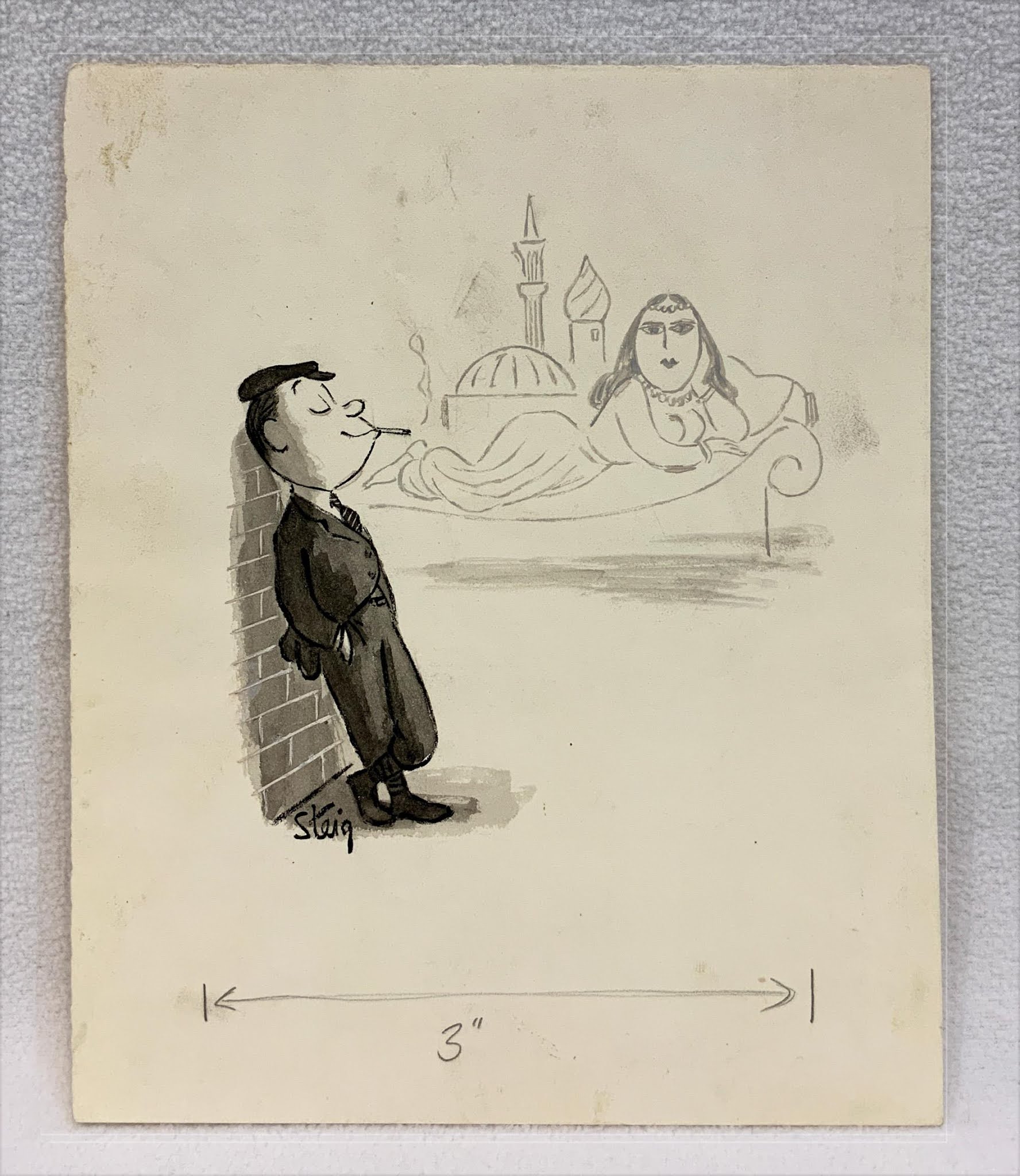
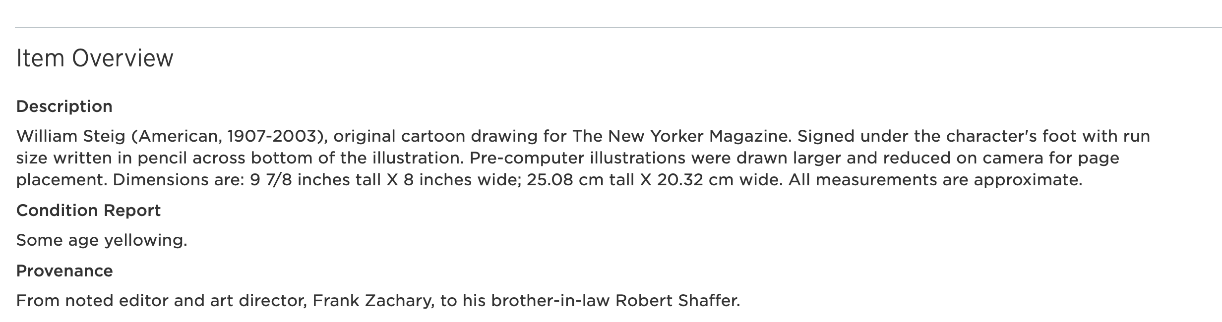
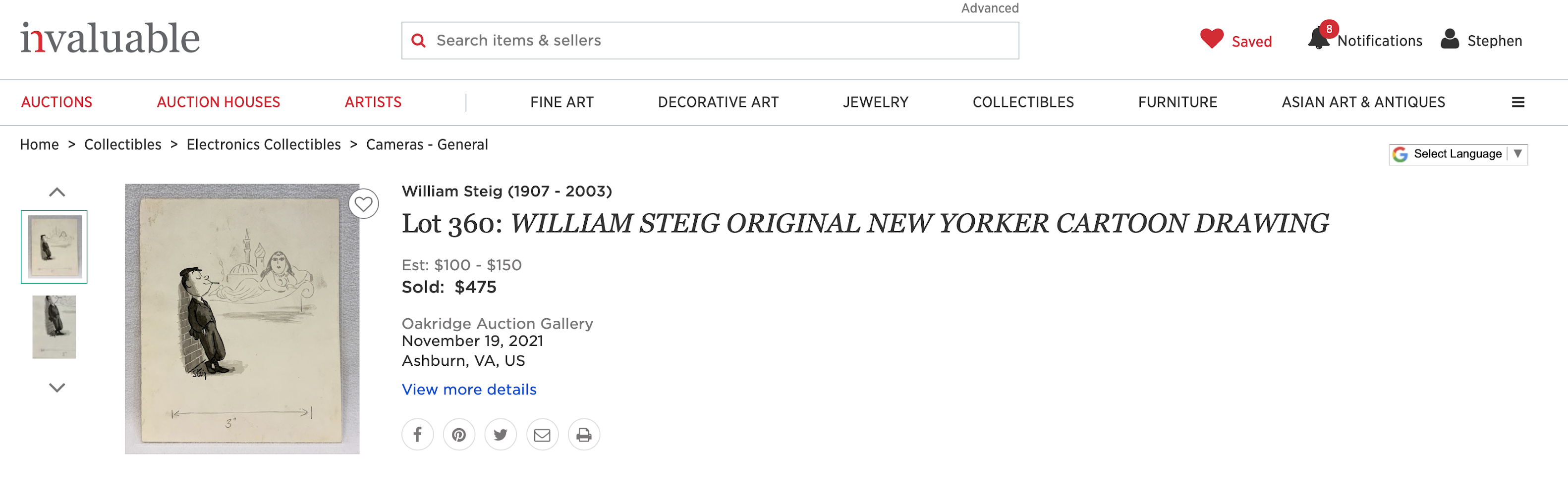
Original cartoon art by William Steig from the 1930s depicts one of his older small fry characters showing off his maturity by smoking a cigarette and having big boy thoughts. These thoughts transport him to an exotic fantasy seemingly out of the Arabian Nights.
Steig's "Small Fry" series was published in The New Yorker, for the most part, and this original does bear printer's markings suggesting publication somewhere. Beyond that, specific printing history isn't indicated. The original once belonged to Frank Zachary, a pioneering editor and art director, who died in 2015 at the age of 101.
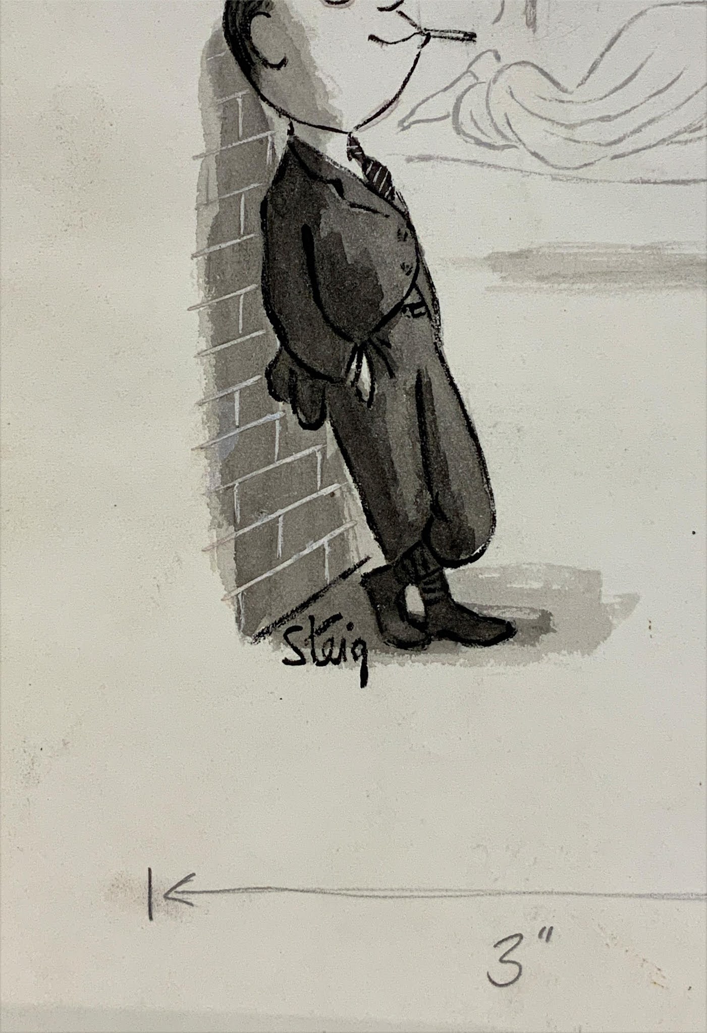
William Steig's signature
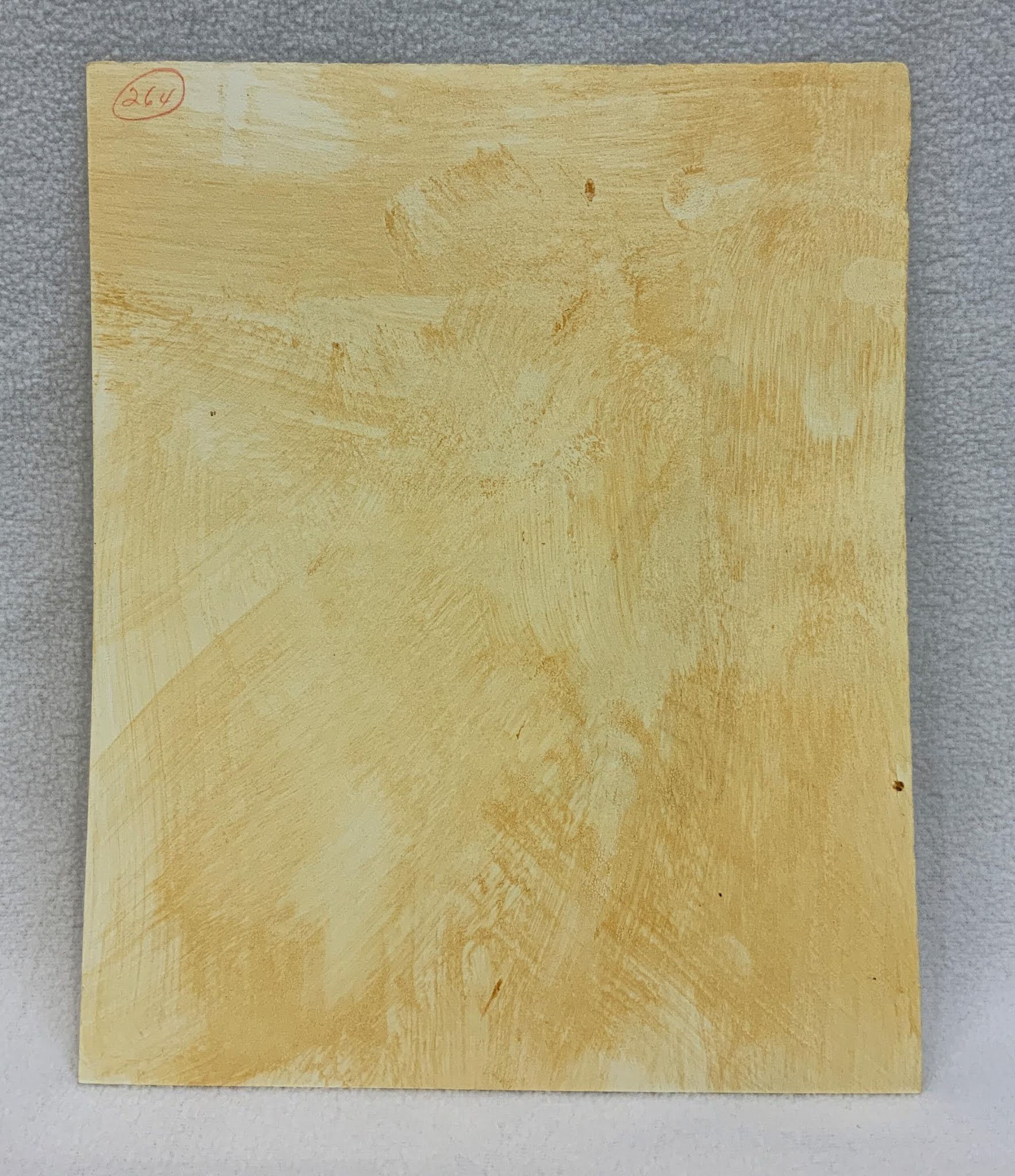
Verso with glue residue, but no New Yorker markings
William Steig Oakridge Auction Gallery listing accessed the week prior to the sale
New Yorker cartoonist Peter Arno (1904-1968) occasionally repurposed a published gag idea for a different market. He didn't exactly copy himself, but he might on occasion revisit a very similar scenario. I got to thinking about this earlier in the month when I saw a New Yorker original of his on display at Swann Galleries a few days before the December 10 Illustration Art sale.
"Pretend you don't notice them." Peter Arno Framed original art The New Yorker, March 10, 1934, page 18
This gag is indeed a curiosity. First off, why are there two Peeping Toms? Wouldn't one be the more typical number? Two raises the ante. Why is this couple attracting a crowd? Well, we know it isn't because of the speaker, Arno's Timid Man. And why has Arno obscured the man's partner with the bed canopy? This means the voyeurs can see the hidden figure but we can't, a tantalizing state of affairs that leaves much to our imagination and allows for at least a possibility or two. Is his partner, as we might reasonably expect, one of Arno's typical voluptuous bombshells? That certainly would explain what all the fuss is about and I believe that is Arno's intention. But, to go out on a precarious limb, could his partner perhaps be a man? That would not be in any way typical for Arno, but the unconventional composition itself leaves just enough room for such a suggestion. Now let's look at the published New Yorker cartoon alongside a related bit of mischief from College Humor:
"Pretend you don't notice them."
Peter Arno
The New Yorker, March 10, 1934, page 18
"Your husband, Eleanor, what sort of a looking man is he?" Peter Arno Nicholls Gallery contact sheet of original art College Humor, c. mid-1930s
The College Humor cartoon, on the other hand, doesn't try to leave anything to the imagination. I don't know the exact date it was published, but it seems to come roughly from the same time period and to be related at least somewhat to the New Yorker cartoon. My belief is that the New Yorker's cartoon came first, but it doesn't necessarily have to be so. Now the New Yorker's audience was a sophisticated and urbane crowd and they loved Arno's witty and suggestive gags. The College Humor gag seems a bit less nuanced, aimed at the younger unattached man eager to seek his pleasure at any and every opportunity. One suspects College Humor's readers must have loved Arno's work every bit as much as the New Yorker's readers did. The listing from Swann Galleries includes the technical information and the sales result:
"Pretend you don't notice them." Peter Arno Framed original art The New Yorker, March 10, 1934, page 18
Note: My several posts on Peter Arno's appearances in College Humor may be eyeballed collectively here. You'll see just a few other examples of themes Arno used in both the New Yorker and College Humor. I am always eager to learn more about his non-New Yorker published gag cartoons including his original art from College Humor. Naturally, I would love to know which issue of the magazine contained "Your husband, Eleanor, what sort of a looking man is he?" I would also like to track down other College Humor Arno gags that have yet to appear on this blog. Can you help, Kind Reader? Here's looking at you, kid.
As we saw in yesterday's post, William Steig was one of several cartoonists who participated in an advertising campaign for American Express Travelers Cheques in the early 1950s. His 1952 ad published in the New Yorker draws on his popular Small Fry series "Dreams of Glory," here showing a young boy's dream of an opulent lifestyle.
"And to insure the safety of your trip, Sir, here are your American Express Travelers Cheques." William Steig The New Yorker, May 3, 1952, page 63
Steig was to follow up with a very different advertising campaign for travelers checks from First National City Bank (today Citibank). The ads featured his cartoons exclusively and ran from 1959 to 1963 in the pages of the New Yorker and perhaps in other publications too. These cartoon advertisements are meant to appeal to upscale readers taking advantage of the dawning era of commercial jet travel. They show people, often couples, being preposterously well-cared for in exotic locales—but also closer to home. Of course, none of these laughable scenarios is meant to be taken as a literal benefit of carrying the travelers checks. The earliest of the ads I found dates from January 3, 1959 and features a couple happily receiving the red carpet treatment. Other patrons, it will be readily noted, are not carrying First National City Bank Travelers Checks and seem dismayed that they are not entitled to the white glove service and thus have to carry their own bags. (Why should that be? Do they not have enough cash to tip the bellhops?) The tag line, which will be repeated in other ads, reads, "the nicest things happen to people who carry First National City Bank Travelers Checks." The ad was run again that year in the June 6 issue; several of the ads were to appear more than once.
the nicest things happen to people who carry First National City Bank Travelers Checks William Steig The New Yorker, (January 3, page 11 and)June 6, 1959, page 18
The ad for March 7, 1959 depicts a couple being given preferential seating in a nightclub. Again, who wouldn't want to be treated this way? Most of us have more experience like that of those unlucky patrons in the back still waiting for a seat. There is a certain rather obvious snob appeal to these ads.
the nicest things happen to people who carry First National City Bank Travelers Checks William Steig The New Yorker, March 7, 1959, page 49 (and August 8, page 51)
The ad for April 4, 1959 brings us out of doors to a train station. Our man with the travelers checks is greeted with considerable fanfare by a marching band. And what exactly does that exemplary treatment cost? The implication may be...nothing! One is simply treated better when one carries travelers checks and people know you have purchasing power.
the nicest things happen to people who carry
First National City Bank Travelers Checks
William Steig
The New Yorker, (April 4,)September 12, 1959, page 65, (and November 7, page 11)
the nicest things happen to people who carry First National City Bank Travelers Checks
William Steig
The New Yorker, (April 4, and)September 12, 1959, page 65, (and November 7, page 11)
In 1963, the tag line was altered to "First National City Travelers Checks—they're better than money." The word Bank was omitted, making the product less of a mouthful. Steig now had a little more leeway to take his art in new directions, to a far-away classroom, for example:
"And when they travel they carry First National City Travelers Checks —they're better than money." William Steig The New Yorker, March 2, 1963, page 11
There are no visitors on the reservation this time around:
"Wampum, shwampum, give me my allowance in First National City Travelers Checks—they're better than money." William Steig The New Yorker, July 6, 1963, page 17
"What can we do? He paid with First National City Travelers Checks —they're better than money." William Steig The New Yorker, September 28, 1963, page 57
Note: There's a lot more to William Steig than travelers checks. You can find a varied collection of advertising art by Steig on Ink Spill. Just follow the links to Part 1,Part 2, and Part 3. Be sure to mention who sent you. I might well have missed some examples of this advertising campaign for First National City Travelers Checks that were published in the New Yorker. Please inform me if you know of any such Steig ads that I have not accounted for. William Steig is one of those world-class cartoonists who produced excellent work over many decades. Today, some of his vast output sadly has been forgotten. I am always eager to hear from those with scans or photos of original art or published rarities by this artist. Quick Links to the Attempted Bloggery Archives: